How Climate Change Feels Around the Globe
When studying at the Spiced Academy, I decided to graduate with a project which will relate to climate change but also to the people. Because with my personal history of helping environmental NGOs, the topic is ever present in the back of my mind. And I had tried a lot to help the environment, but we should not forget about the vulnerable communities, too. This project is describing how many people were exposed to extreme heat, differences between countries, relation to their economic situation and the present trends. In the end, I discovered some expected disparity across the world, but as usually, the situation is more complicated than simply dividing countries into rich and poor.
Summary
I performed my work in Python. The tasks included:
-
Finding data (OECD, NASA, UN).
-
Exploring and cleaning (Pandas).
-
Combining data sets and analysis. Time series, correlations, A/B testing, k-means clustering (Pandas, SciPy, Scikit-learn).
-
Informative and understandable visualizations (Plotly Express).
-
Drawing conclusions.
The data
After reviewing available sources, I discovered exciting data sets in the database of OECD, describing the exposure of populations across the world to different weather phenomena in time. Focusing on extreme temperatures, I performed a detailed analysis of the developments of the last 40 years. Adding climate data from NASA and economic data from the United Nations, I was able to answer even more questions about the pressing issue.
The advantage of (inter)governmental bodies as a source of data is, that the data are highly reliable and also relatively clean. Still, it was necessary to perform some cleaning and data wrangling to be able to proceed with all the intended calculations and merge different datasets together. I did all this processing using Pandas.
You can see the code for cleaning in the cleaning.ipynb notebook in my GitHub repository.
The main topics of the analysis were:
-
What percentage of people have direct experience with extreme heat?
-
Does this number change over time?
-
How much is it related to the global temperature anomaly?
-
Is there a clear link between wealth and heat exposure of populations?
The first deep get-to-know with the data by using statistical methods belongs to the most exciting parts of my work as a data analyst. Until now, we can only guess but with real numbers, the true links, dependencies, and connections come to the surface. I used several useful tools to analyze the data. Pandas comes with calculations of correlation coefficients, which I used for establishing the link between time and population exposure of individual countries and of the world. What I was even more curious about was the assumed correlation between population exposure and temperature anomaly (how much warmer the climate is compared to the past). It proved to be really strong. Also, warming of about 1 °C led to about 15 % more people exposed to extreme heat worldwide (Fig 1).
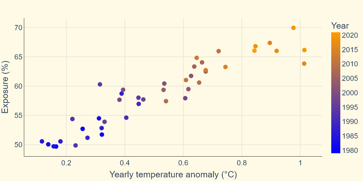
Fig 1. Over the last 40 years, the temperature increased of about 1 °C, leading to about 15 % more people exposed to extreme heat worldwide.
Another tools I used were libraries Scikit-learn and SciPy, allowing me to apply k-means clustering and A/B testing.
The code for the whole analysis can be found in the analysis.ipynb notebook in my GitHub repository.
Visualizations
Analysis and statistics are intriguing but visualizing goes with it hand in hand and allows real overall understanding. I decided to create simple but interactive visualizations in Plotly Express, which could also be exported as static and used in my graduation presentation. I got to practice choropleth maps, scatter plots and linecharts.
The code for all visualizations can be found in the vizzes.ipynb notebook in my GitHub repository and all the plot files in the 'vizzes' folder.
Results
So, what were the main results the data revealed? First, the average proportion of people who experienced extreme heat at least one day per year was lately reaching up to 70 % worldwide and grew fast over the last four decades. The exposure also increased for most of the countries (Fig 2). There were several exceptions, which could have been caused for example by demographic changes and migrations within the countries.
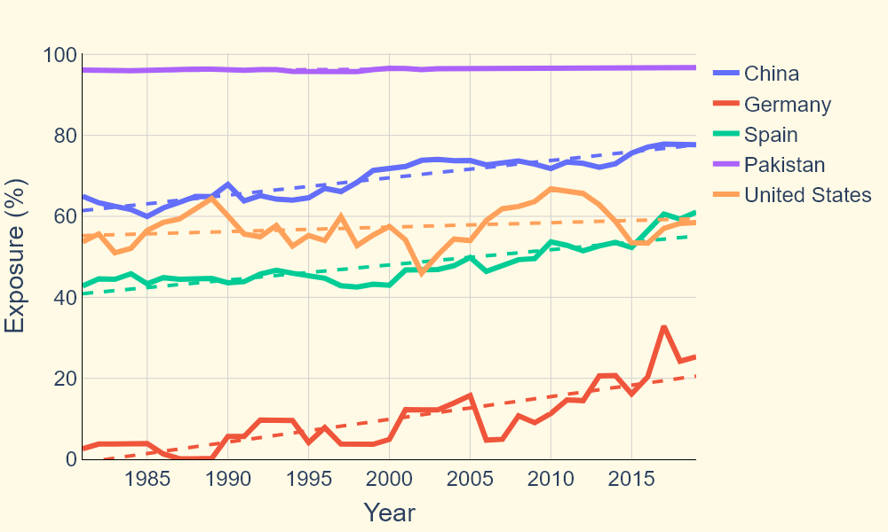
Fig 2. For most countries, the population exposure to extreme heat increased, also shown by the dashed trend lines.
Second, it is possible to get insights from splitting countries into two groups considering population exposure and GDP per capita (using k-means). In one group, the level of inconvenience caused by heat exposure is very large and low GDP per capita, or the GDP per capita is slightly larger but does not compensate for the level of heat. In the second group, we find countries with low population exposures or higher exposures compensated by high GDP per capita. From this I conclude that indeed there is certain injustice about the effects of climate change on different countries and present a map of the two groups. Although the method is simple and results should be a subject of further discussion, I personally find it an interesting result to think about (Fig 3).
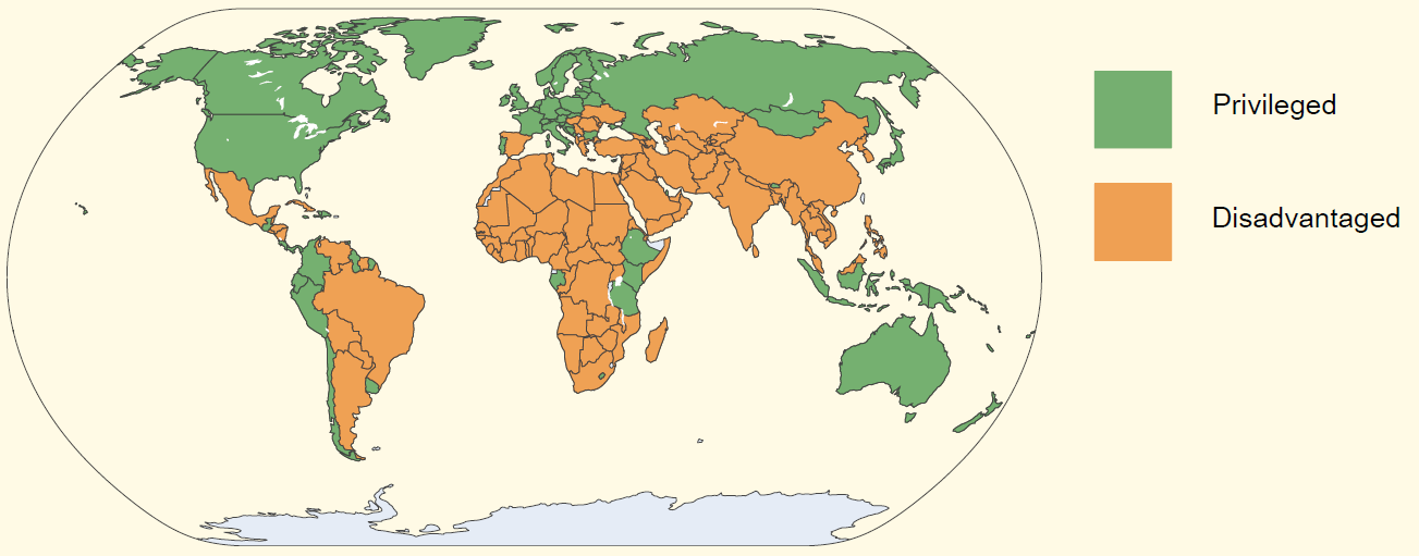
Fig 3. Countries can be split into two groups, considering their exposure to heat and material well-being.
Curious about more insights into the data? You can find all the results in my graduation presentation.
Next steps
There is so much more to explore about this topic. I would be happy to continue when the time allows but if a curious reader wants to continue on their own, here is several suggestions:
-
Refine the method of splitting countries into groups based on their exposure to heat and economic situation.
-
Investigate how individual countries moved within the GDP/exposure space in the past.
-
Explore more about the impacts of climate change in the database of OECD: there is data on flooding, droughts, wildfires, and more.