Tableau is a powerful tool for creating dashboards in a fast and simple way. For presentations, I prefer to create simple plots using Python or R but to share my work
with someone when there is enough time to explore, dashboards can provide so much information. Using Tableau to produce dashboards is fun and here I would like to share with you
my three products I have liked the most so far and which I showcase on my Tableu Public.
The tech stack I use for preparing data is SQL and Python with Pandas. Once the files are ready, I upload them into Tableau and the fun begins.
Let's have a look at the three projects.
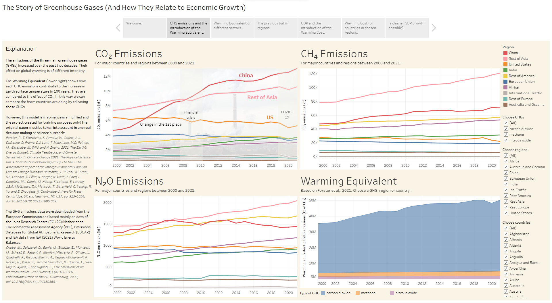
1. The Story of Greenhouse Gases
Ever wondered, how have been different countries doing so far in lowering emissions to protect the climate? And how much green the growth of GDP is?
In a very comprehensive project when learning Python during an online evening course, I prepared this Tableau story to guide you step by step on the journey of discovery.
You will learn:
how much the 3 main greenhouse gasses contribute to global warming,
what is the contribution of different world regions and their economic sectors,
how much warming does the GDP "cost" us in terms of boiling the planet,
if and in which countries exactly is the economy actually greener than 20 years ago
and even more. It is a lot of information, but about a fascinating topic. And in bright colors 😉
In the case you are interested in the code, you can also visit the respective GitHub repository and see my first steps in Python and SQL from March 2023.
This project was a bonus work I promised to do over the weekend when my decision making was slightly compromised by drinking Friday-evening beer.
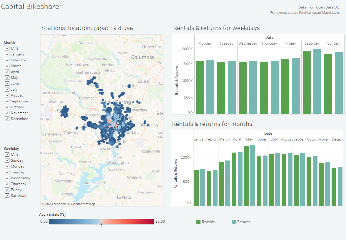
The data was prepared by my friend Puvi (original data source Open Data DC)
and I made the dashboard to support his conclusions during a data science bootcamp graduation.
It is a simple dashboard, helping decision making in a business context.
Just take the lasso, choose any stations you are interested in and the period, and check how many bikes
are being rented or returned!
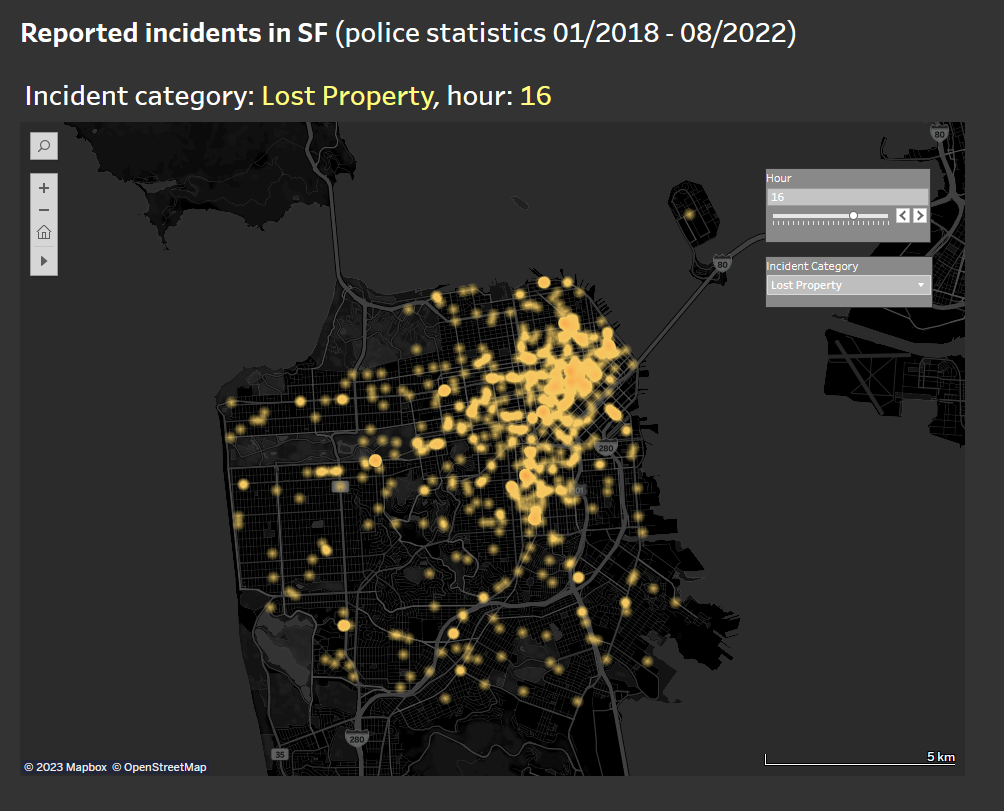
3. SF Crime Landscape
Crime sounds better in the title, but I processed all the incidents reported by SF police, including lost properties and similar events.
In this short story, I played more with the visual style and made it minimalistic about the amount of information.
Sometimes the fewer details the better.
I think the result shows nicely, how much work police have in different districts, what is the proportion of different incidents in the database, the time distribution,
and my favorite part, the density map. Still, some filtering by selection is also possible, so enjoy your interactive trip to San Francisco!